NeoScuba
INeoScuba is an apparel brand catering to SCUBA divers and ocean lovers. This project is my capstone project for my design degree and consists of three main components: branding, a landing page, and an apparel collection.
Notes Some copy for this project was generated by Copy.Ai. All text that serves as captions are written by me.
Project Statement
Branding, Graphic Design, UX/UI, Apparel Design
Illustrator, InDesign, Photoshop, Figma, Copy.ai
Programs Used
The branding for NeoScuba is inspired by what you see underwater. The tone for the brand is upbeat, spunky, and youthful.
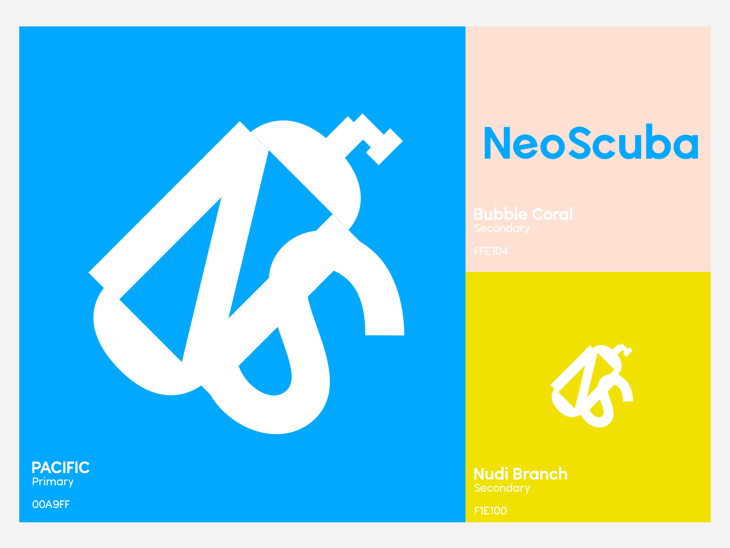
The logo uses the typeface ‘Wavehaus', which I thought was a great nod to the big waves of the ocean. The second version of the logo considers the letters N and S visually. It is inspired by the diver’s logo (the slanted line), and incorporated with it is imagery of a SCUBA tank and a BCD. The motion of the logo is tilted upwards reflecting a diver ascend into sea level.
Colors are named after the ocean and different corals. Blue (Pacific) was chosen to instill trust and to reflect the ocean. Bright and eclectic, the two secondary colors, Pink (Bubble Coral) and Yellow (Nudibranch), brings energy into the brand.
Branding
More about NeoScuba
Problem
Casual SCUBA apparel is outdated and nonexistent.
It’s hard to find casual apparel that caters to SCUBA divers. Most SCUBA apparel are technical gears. NeoScuba aims to be the apparel you wear before and after a dive. This project is inspired by Parks Project who caters to people who love National Parks.
Inspiration
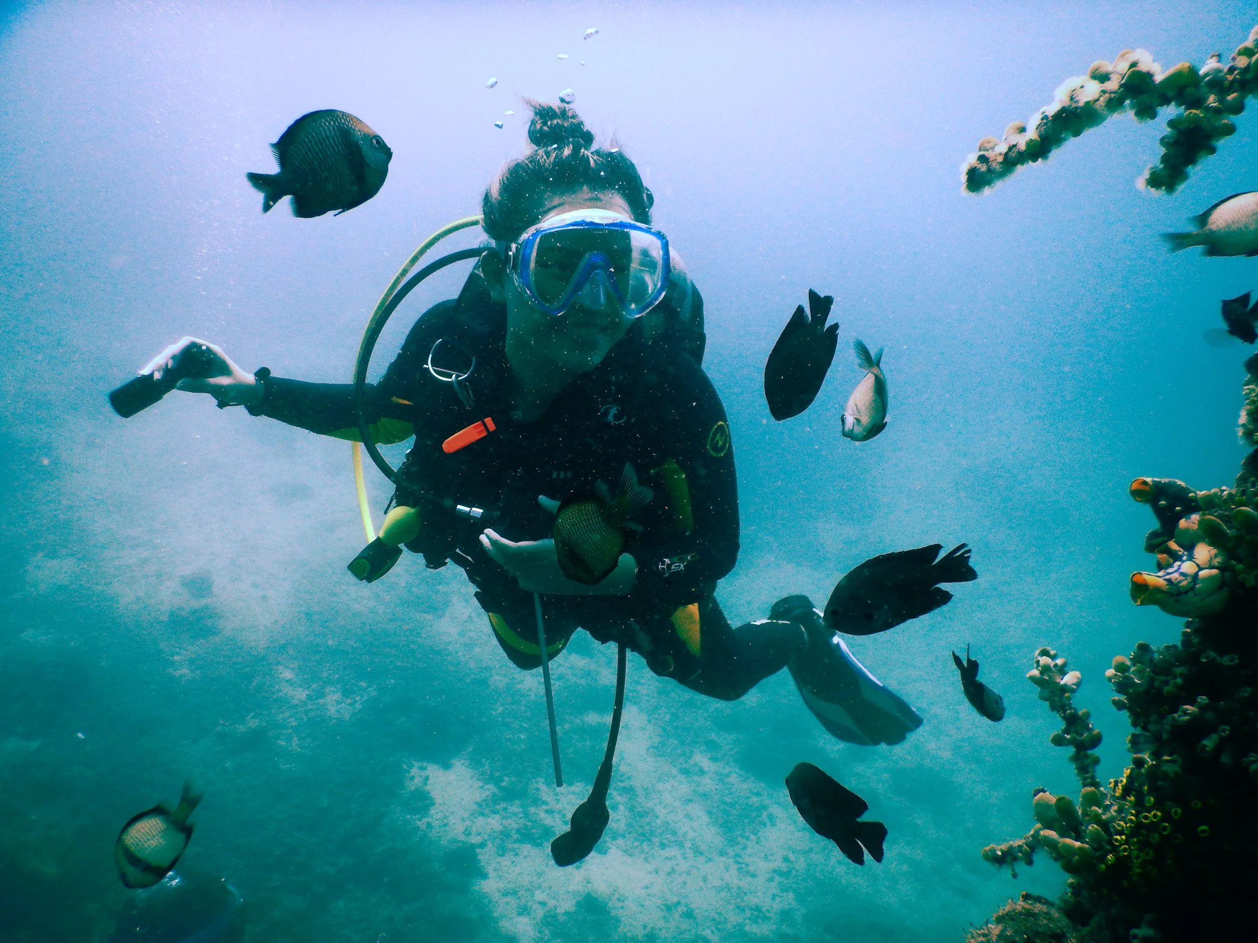
As a SCUBA diver, my last few dives in Anilao, a famous dive town in the Philippines, have been an eye-opener about the state of our oceans. Every time I enter the water to dive, I was surrounded with trash. With this, I was inspired to create a brand that can help fund dive site conservation.
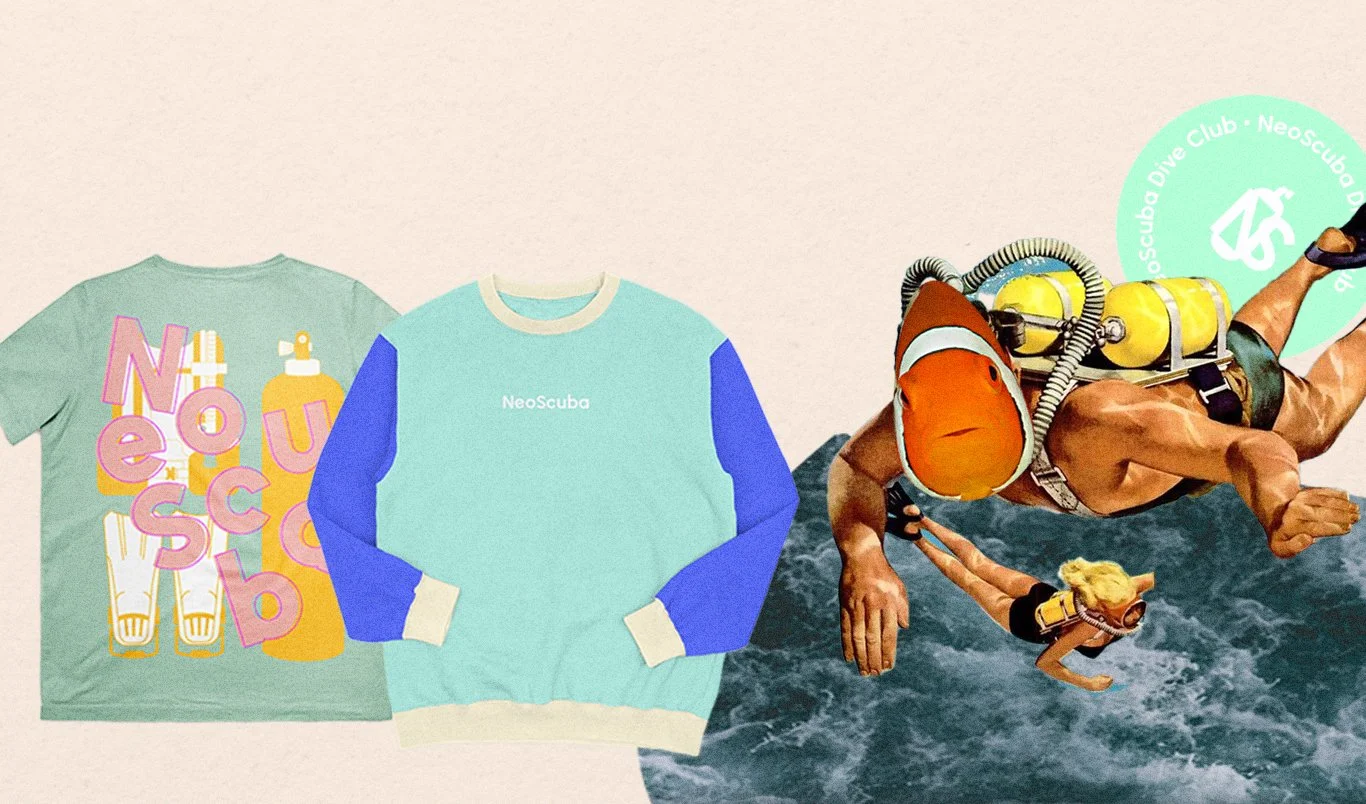
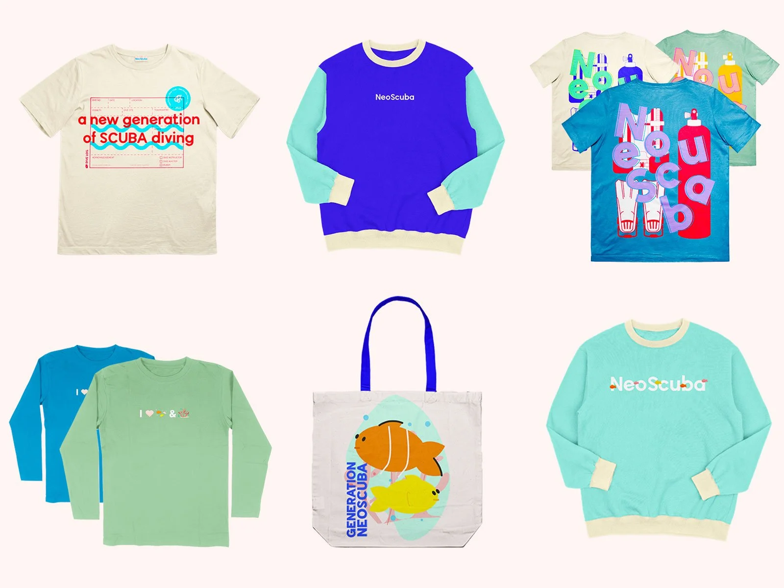
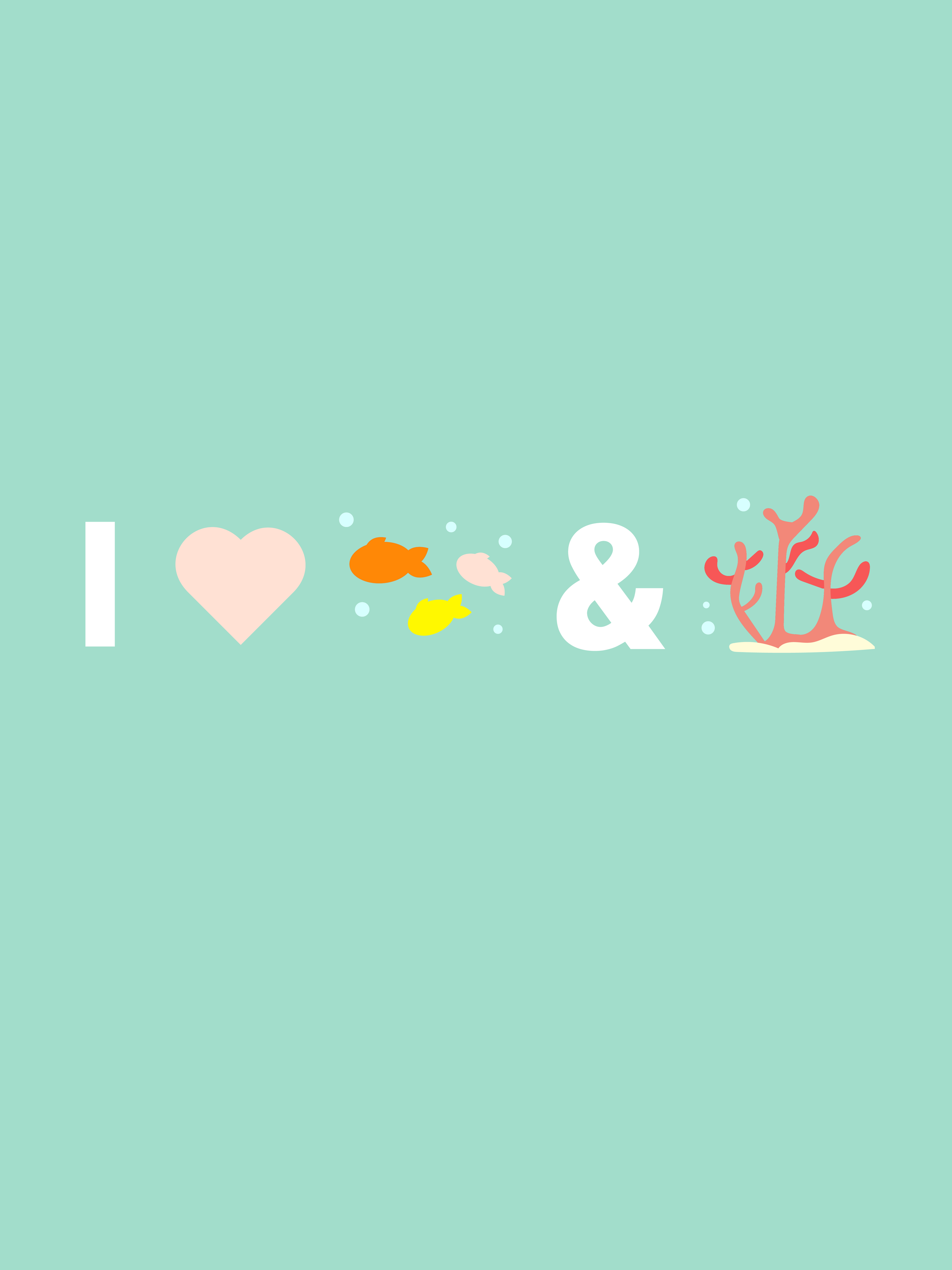
The first collection for NeoScuba highlights a new era for SCUBA diving for the new generation of SCUBA divers. A new generation focused on both exploration and conservation. The idea behind the brand is that some profits would go to dive site conservation and diver education.
Generation NeoScuba
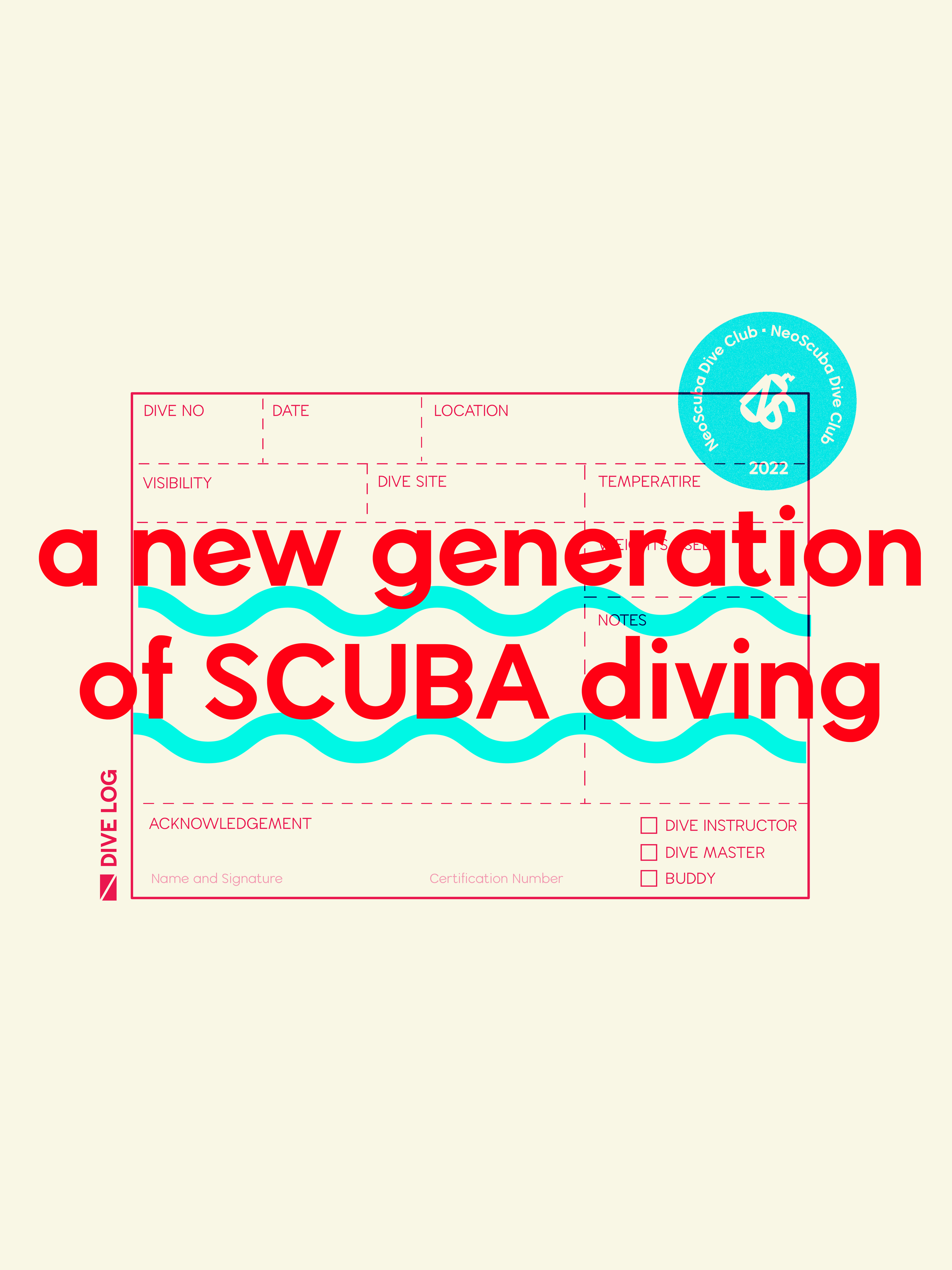
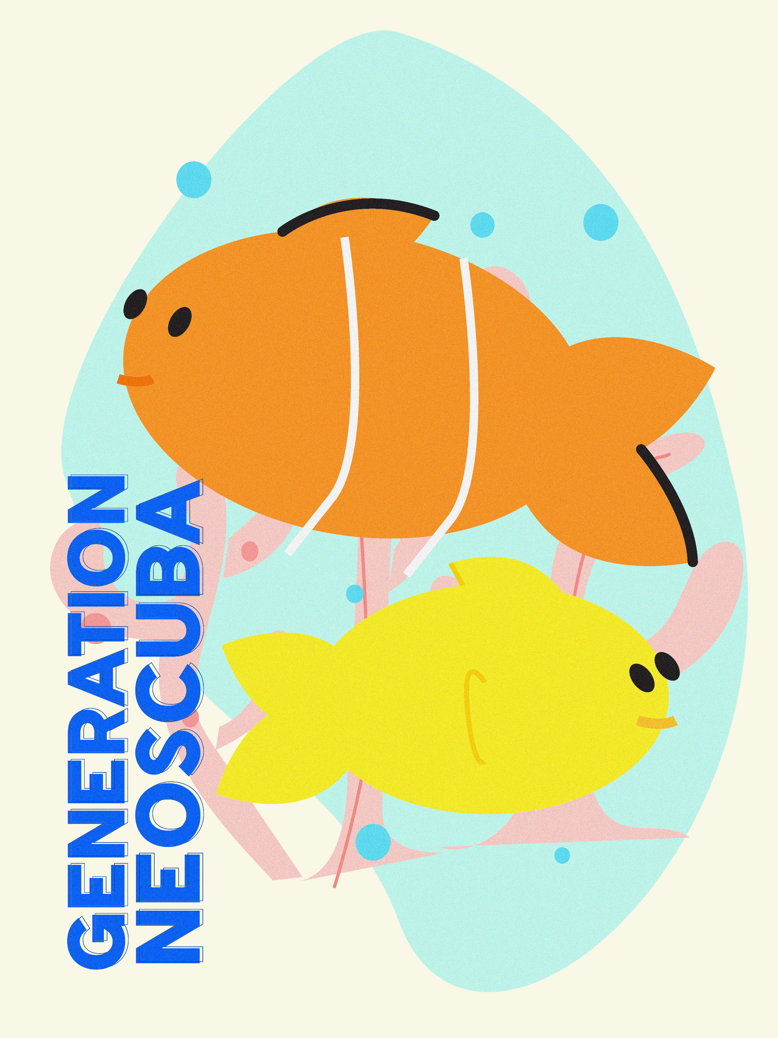
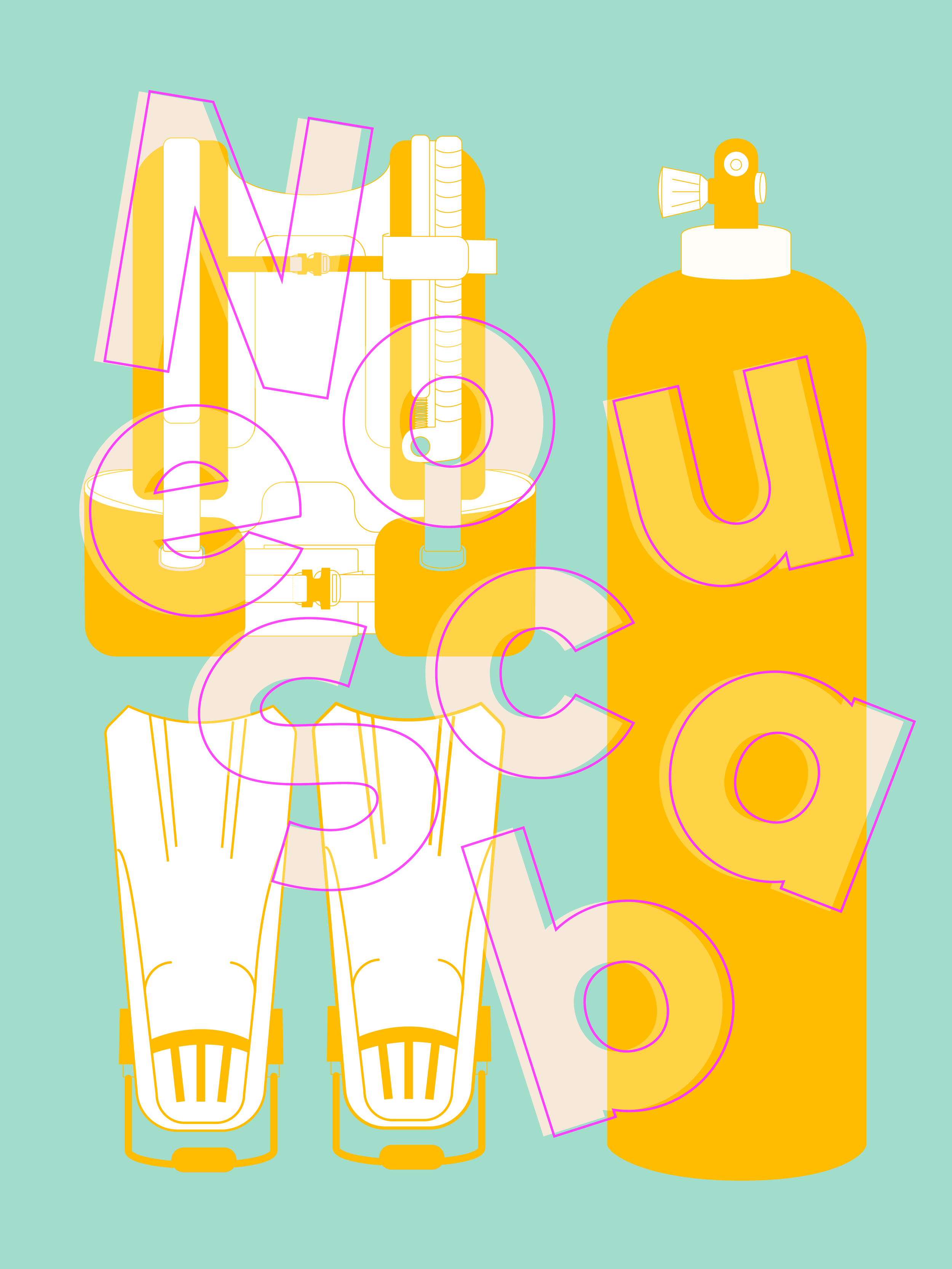
I summarized all this work through designing a storefront website. This prototype ties the entire project together as it showcases all the aforementioned designs.
Storefront Website
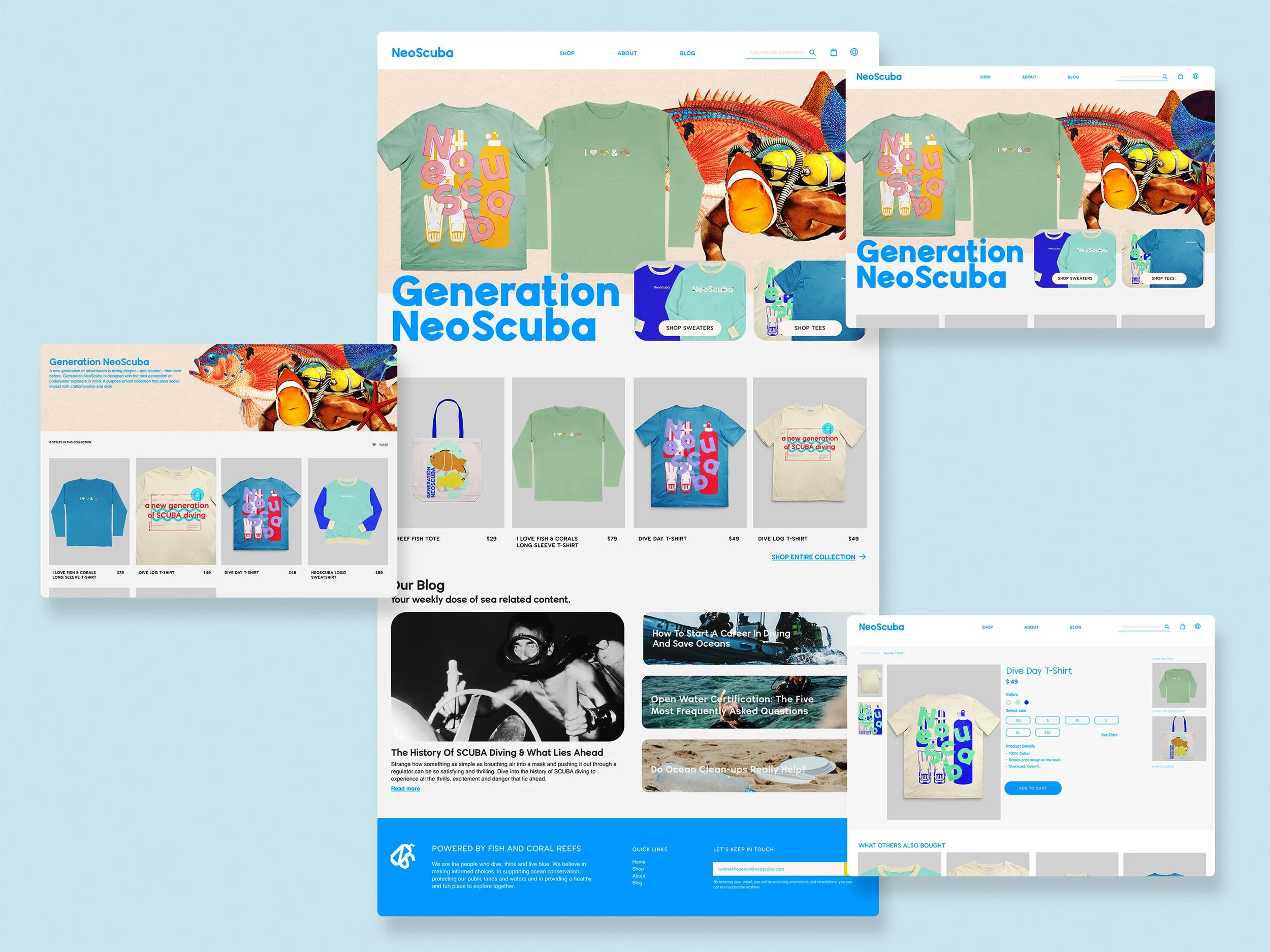
UX Features Highlight
Interactive Navigation Bar
In order to maximize the ‘real estate’ I have on the website, the hover navigation bar allows me to add more information about the site. In addition, it creates a neat preview about the subpages within a section.
Product Cards Hover
Allows the user to view the item and its different color variation without leaving the current page.
Sample Workflow
Buying from NeoScuba.
This workflow showcases the website and how a customer may purchase from the website.
Design Process Milestones
The following section showcases highlights from my design process that moved the project forward.
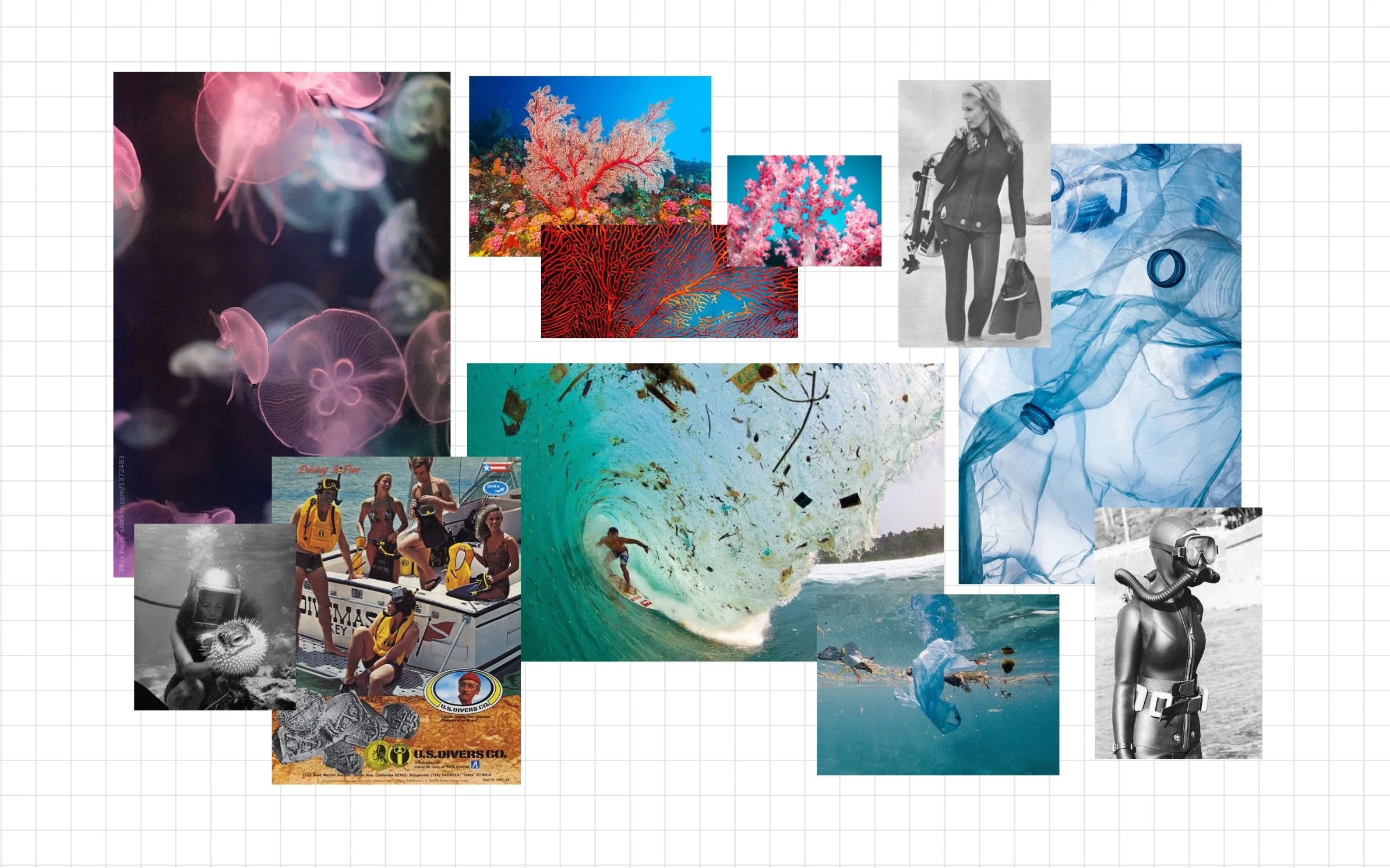
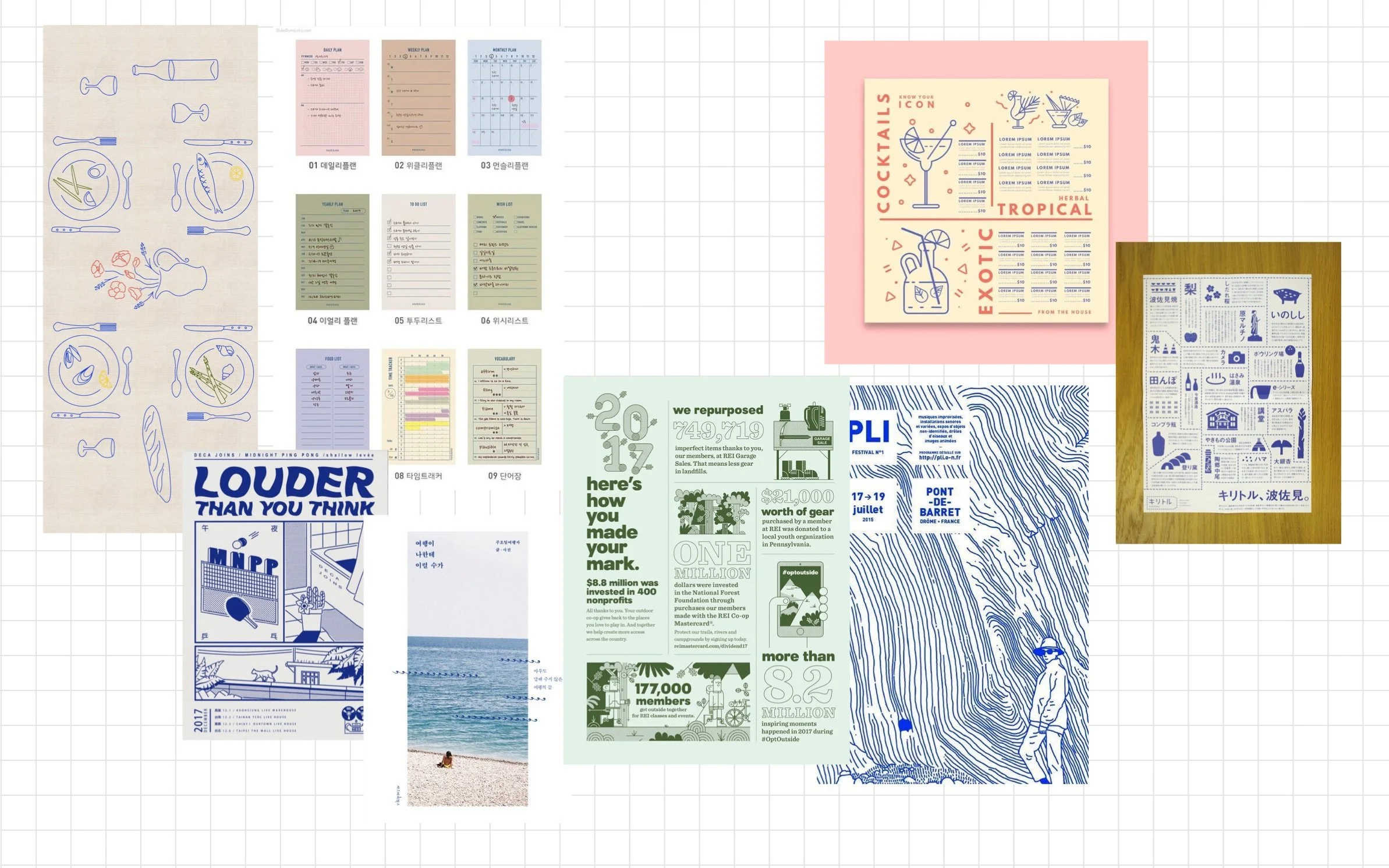
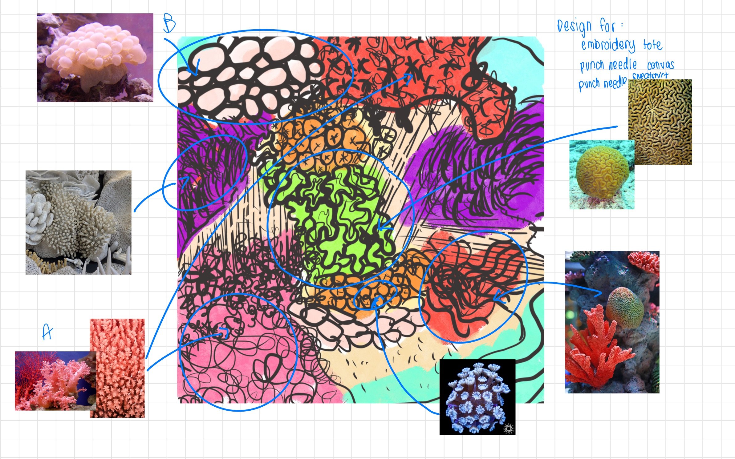
As a self directed class, I had to come up with a design project that would produce three deliverables. I considered three different projects and ultimately chose this one as I felt the most passionate about it. Afterwards, I created a mood board to get a feel of how the designs would look like, what tone to use, and overall to get an inspiration kick.
Brainstorming

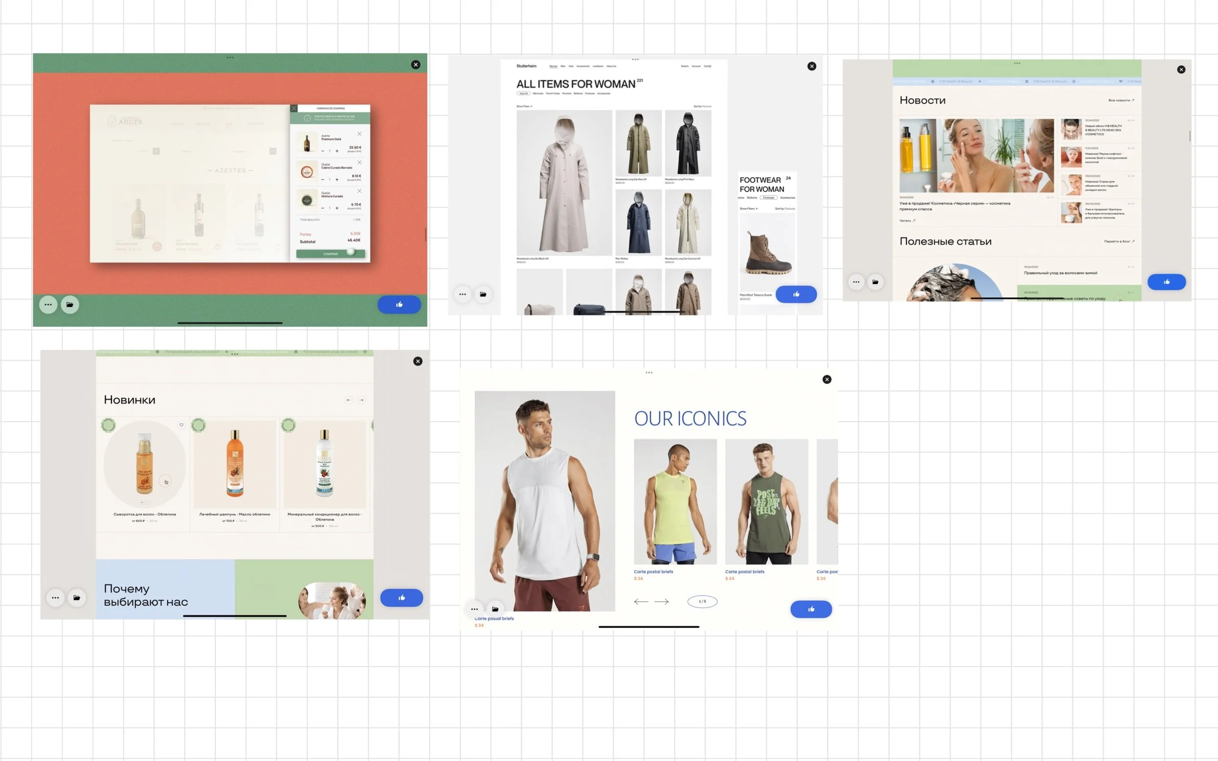
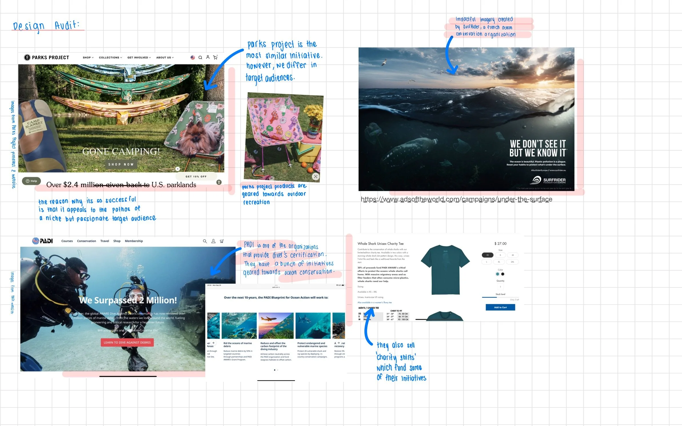
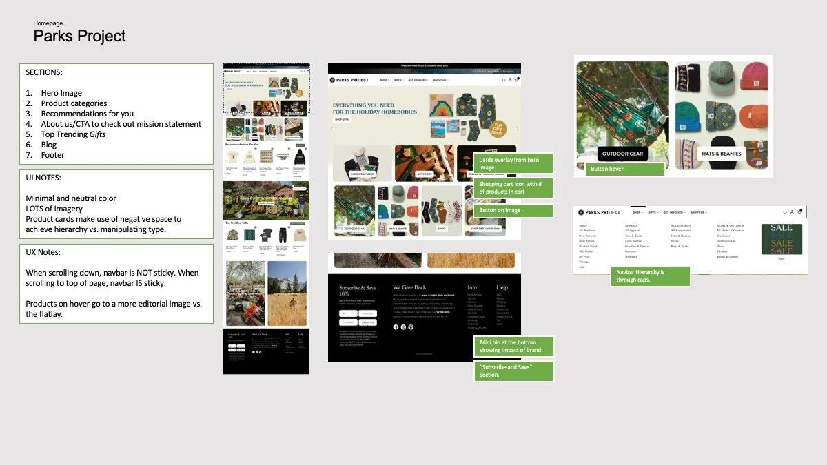
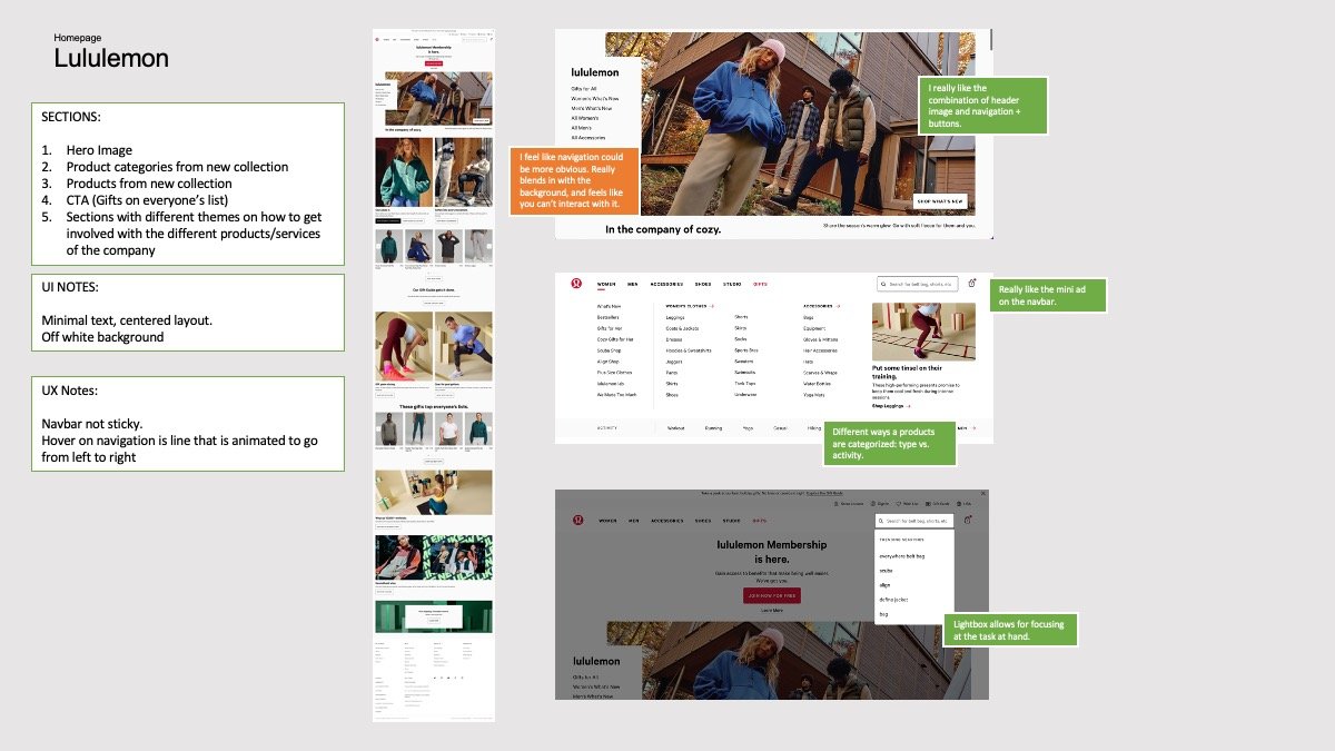
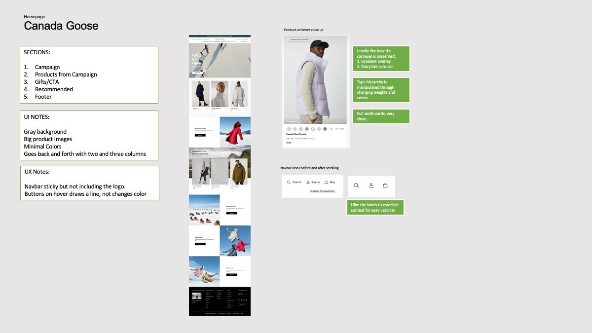
I wanted to get a good sense of best practices in designing for online stores. So, I looked at different online stores, benchmarks both their UX and UI, and incorporated some common themes into the NeoScuba website.
Benchmarking for UI
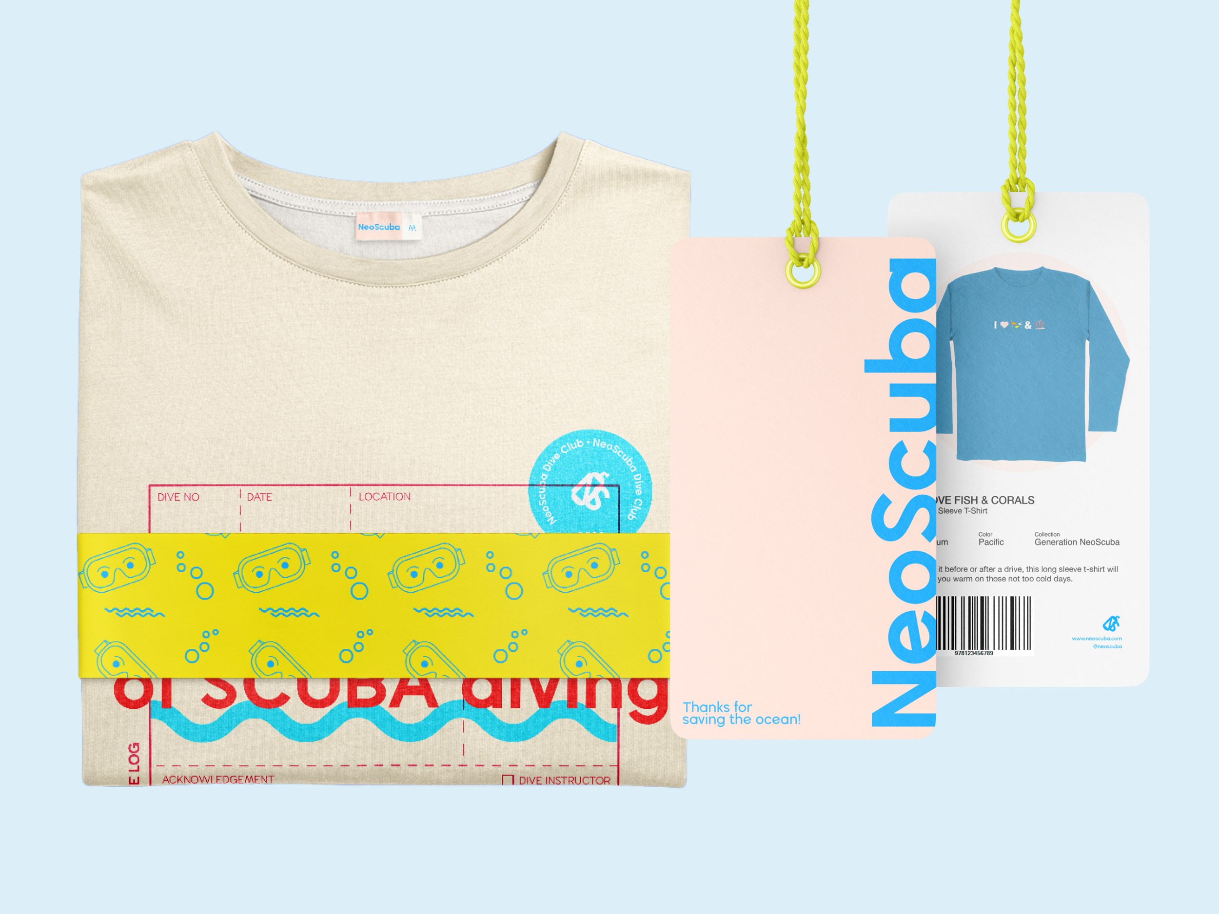
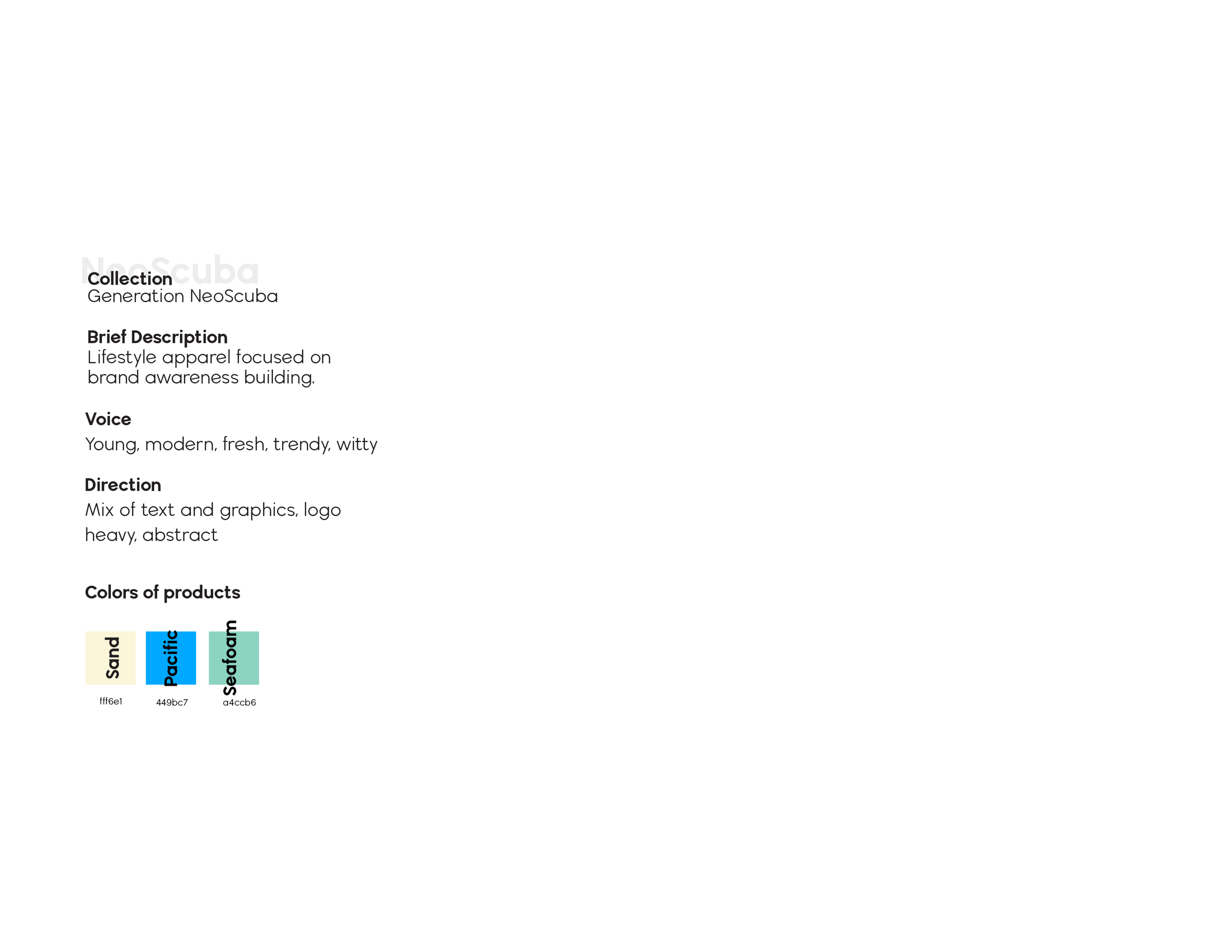
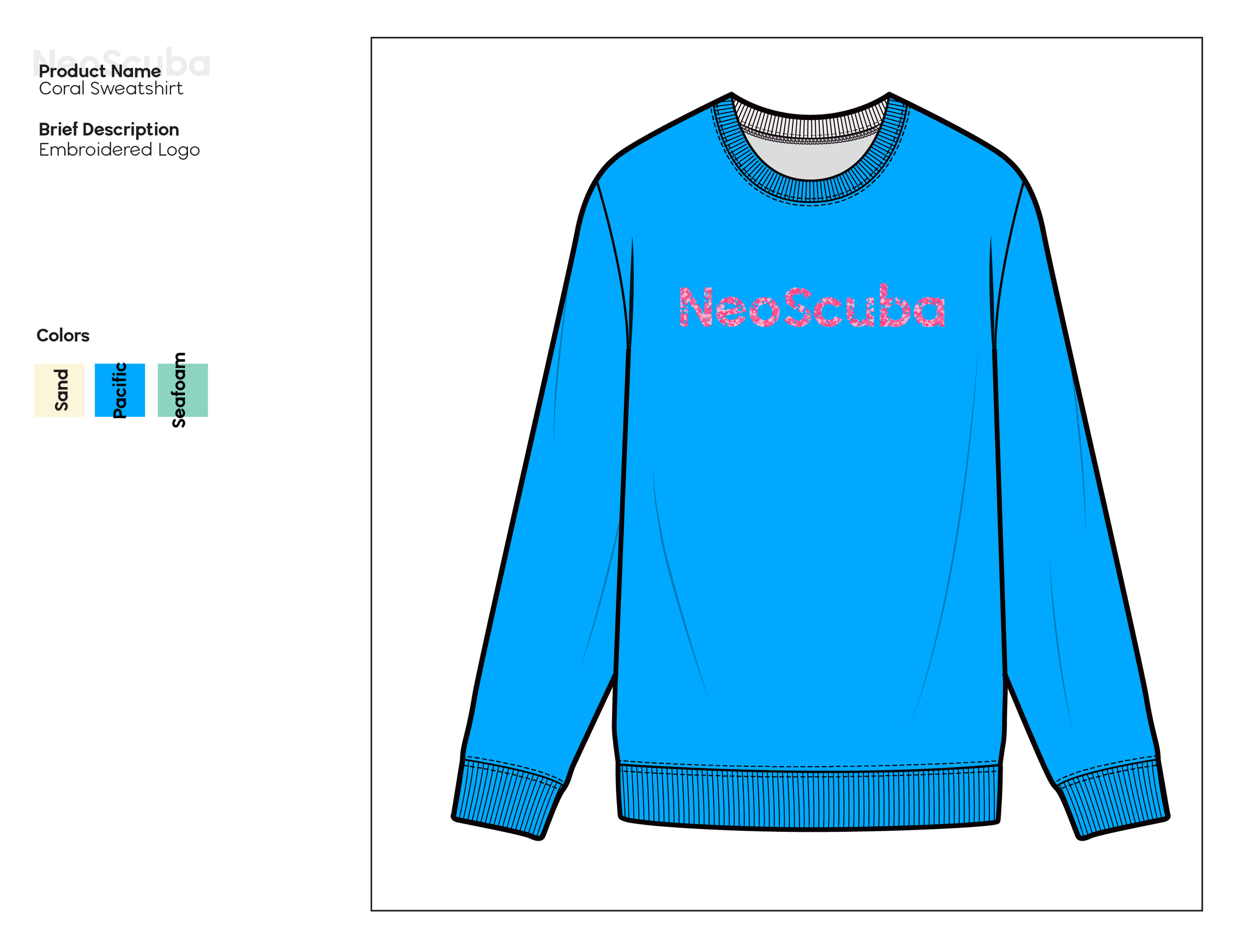
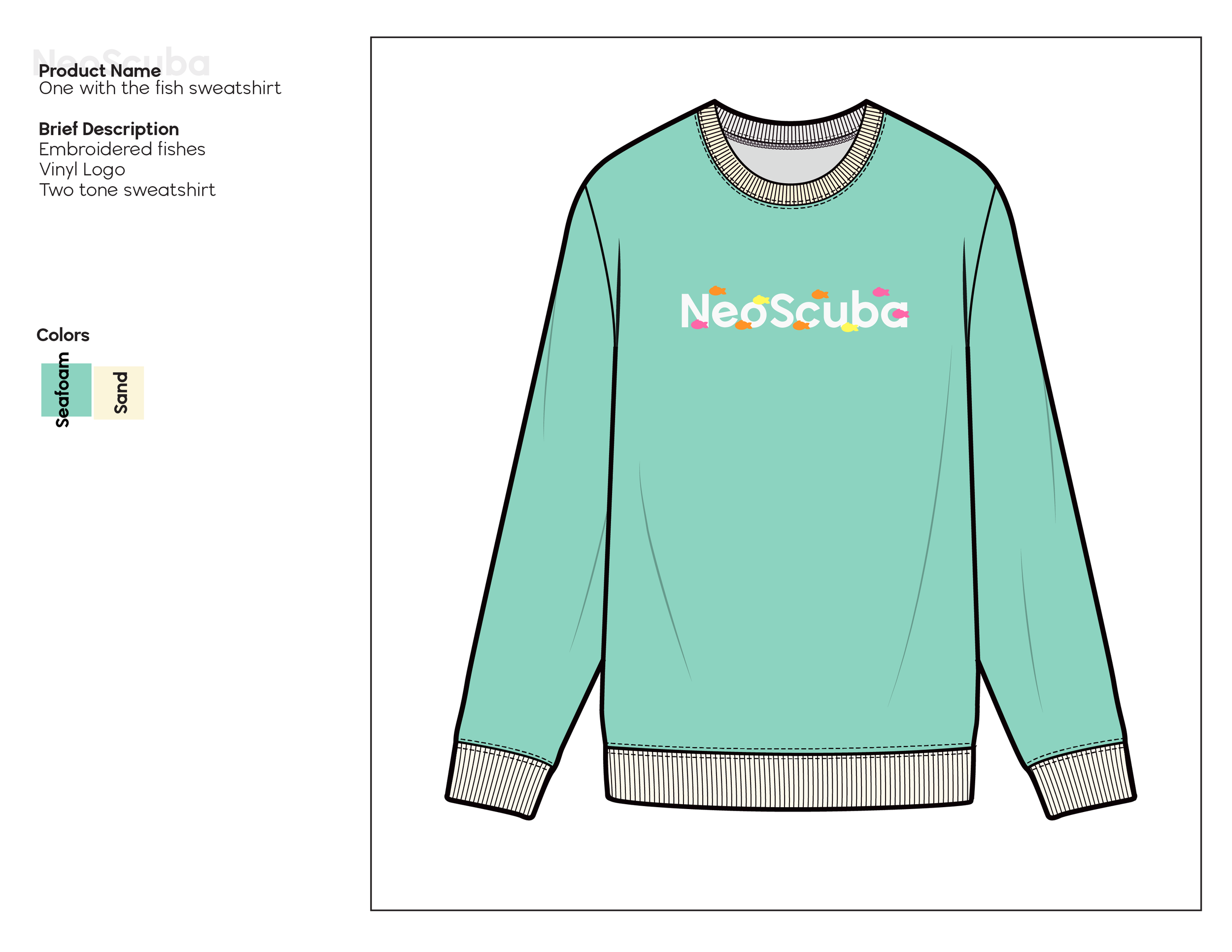
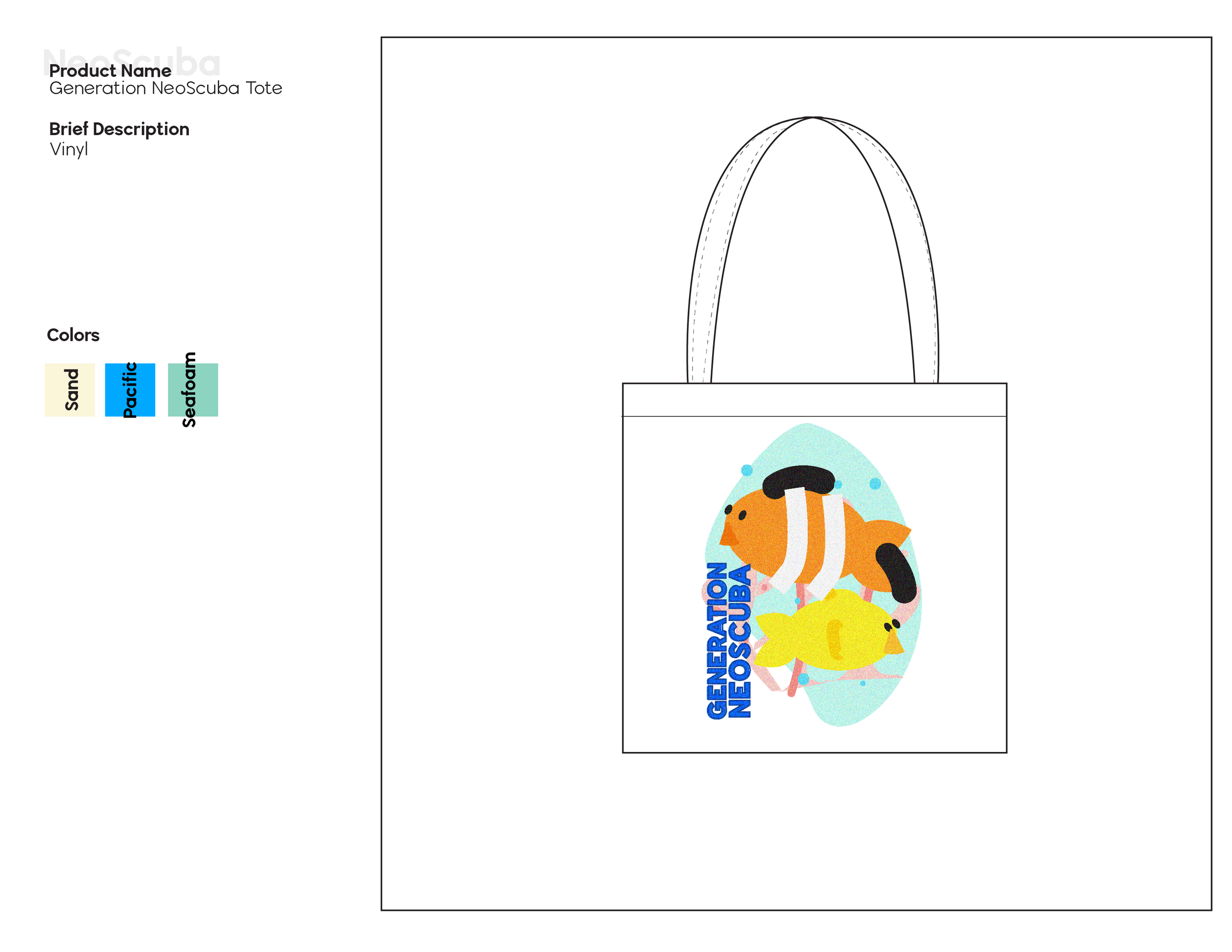
In order to make Generation NeoScuba cohesive, I created a product linesheet to oversee the collection. This guided my design process for the apparel and helped me keep the collection to its purpose, which is brand awareness building. A lot of the designs are focused on using the logo or the brand name, and I made sure to do different spins on it.
Product Development
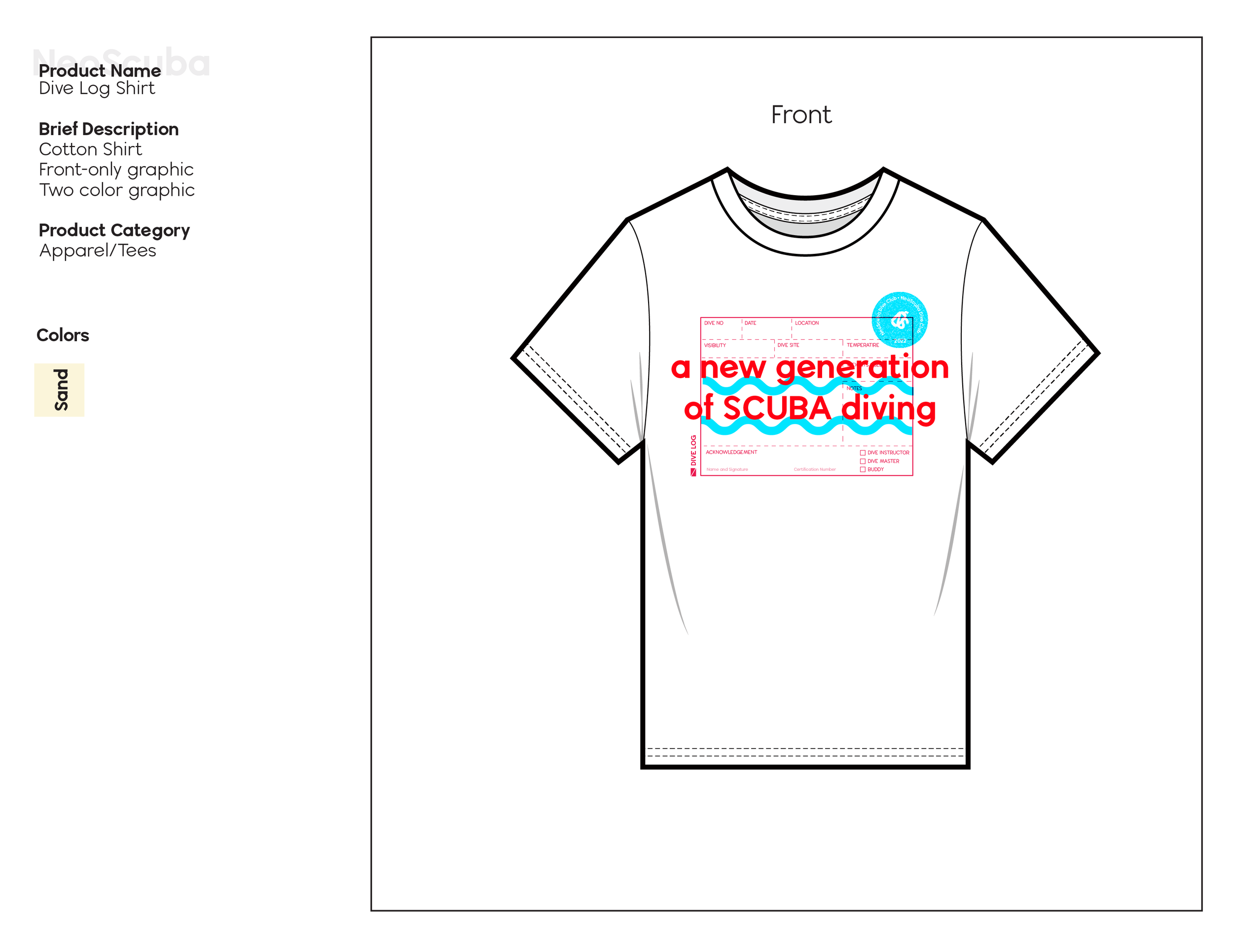
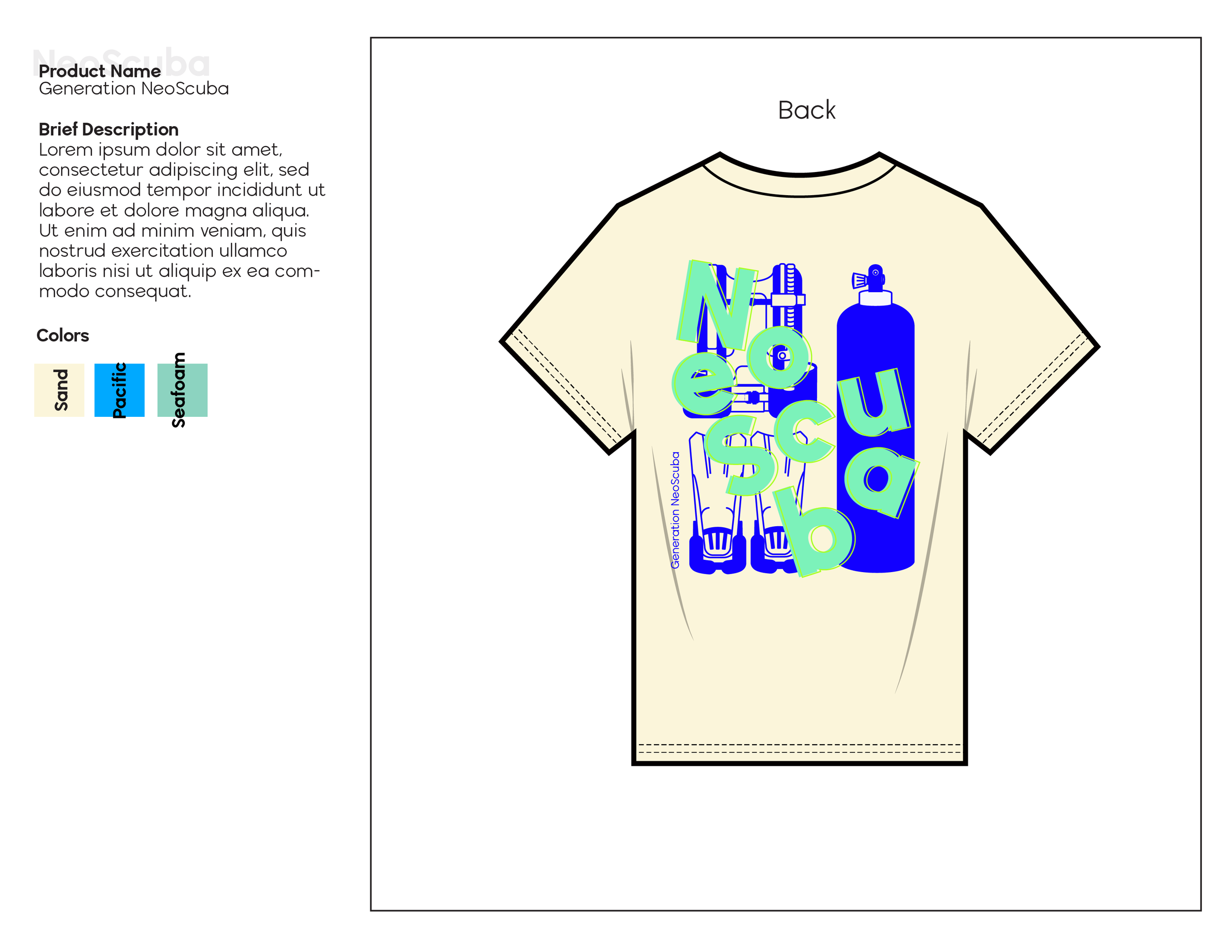
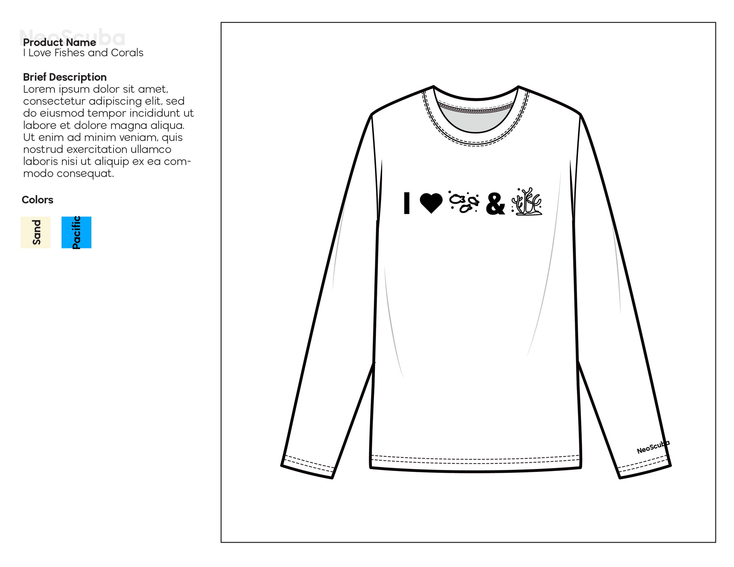
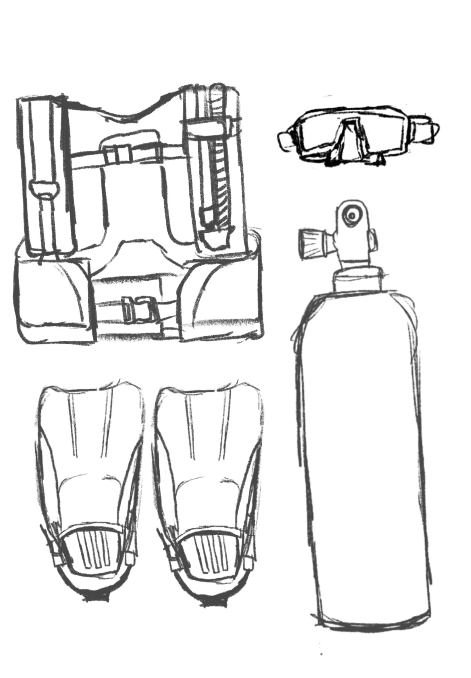
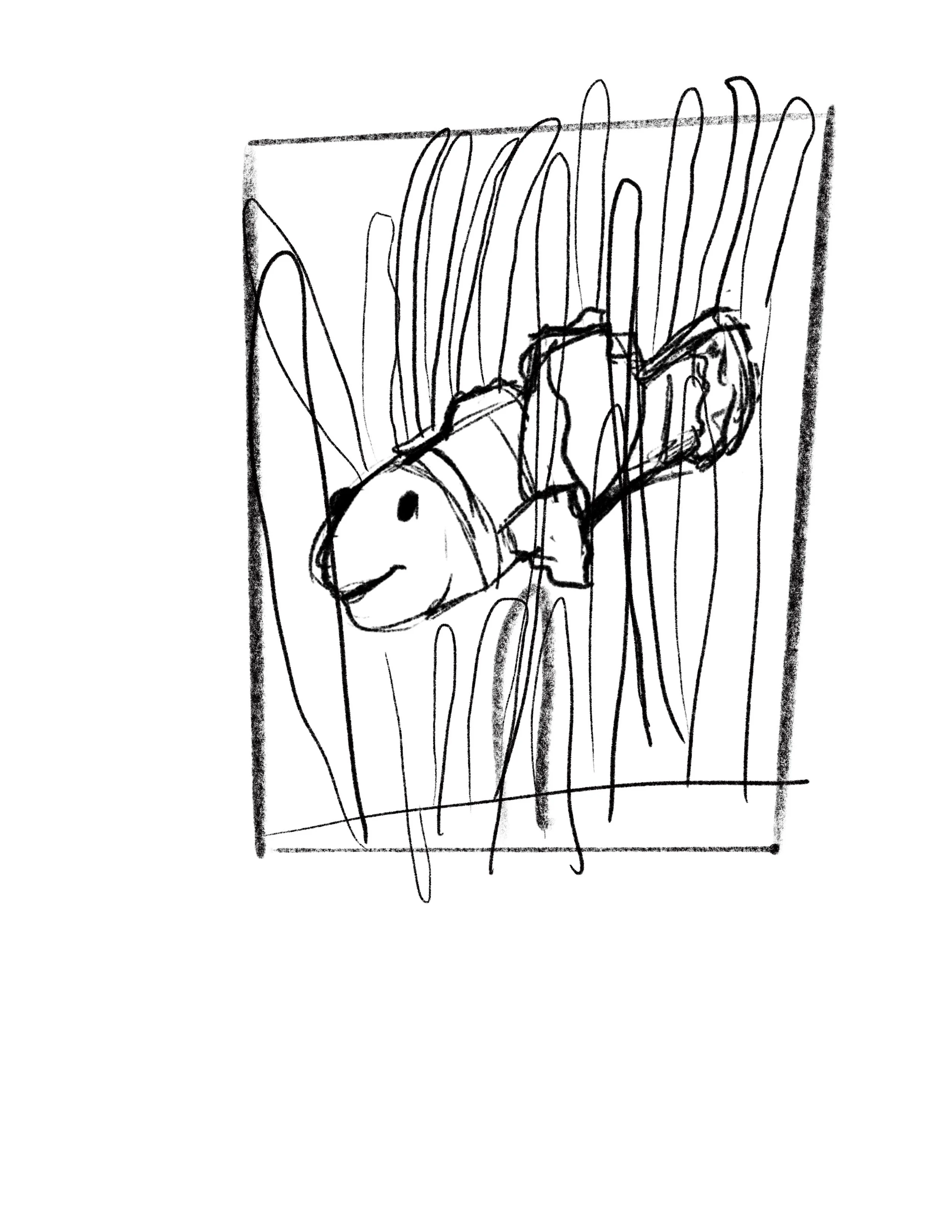
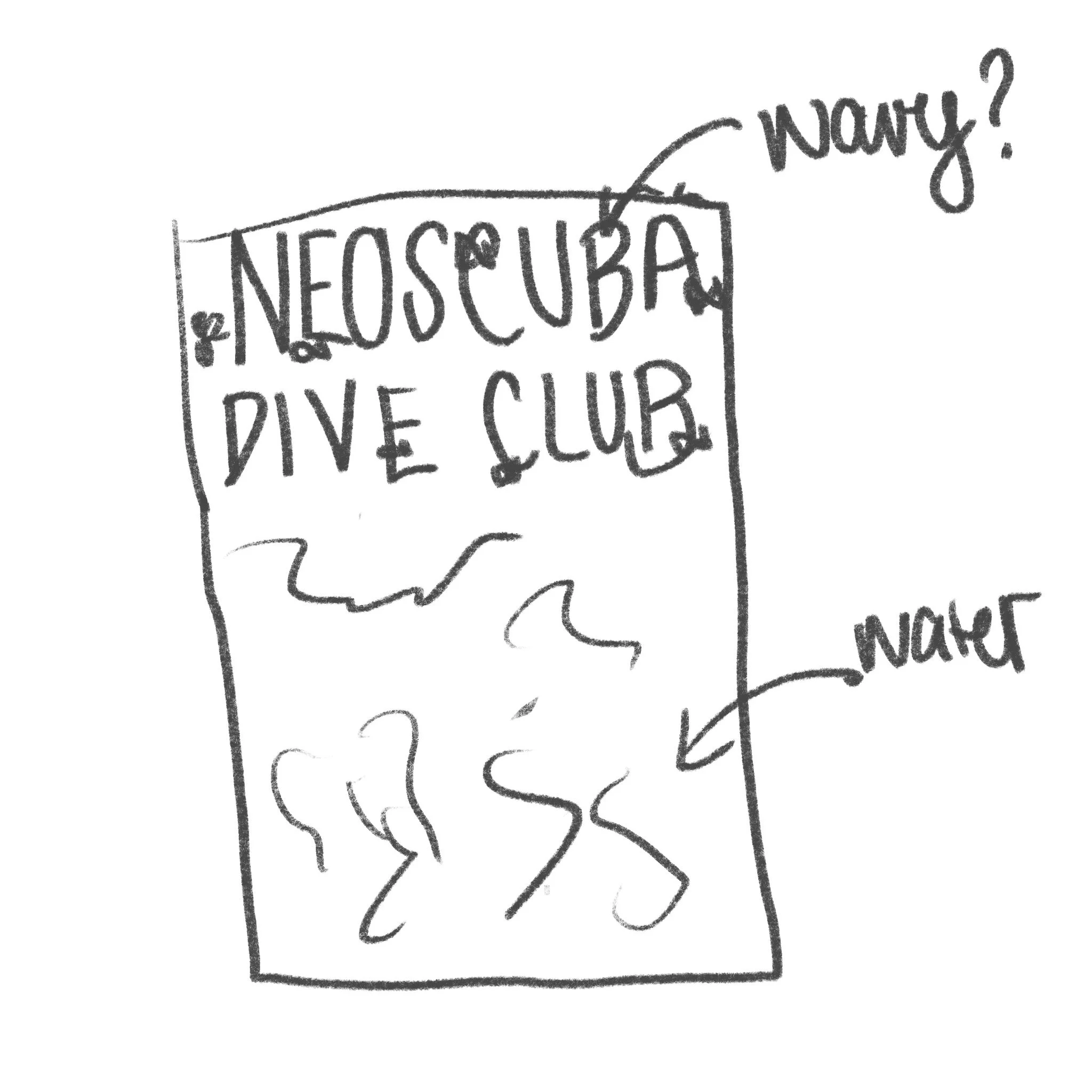
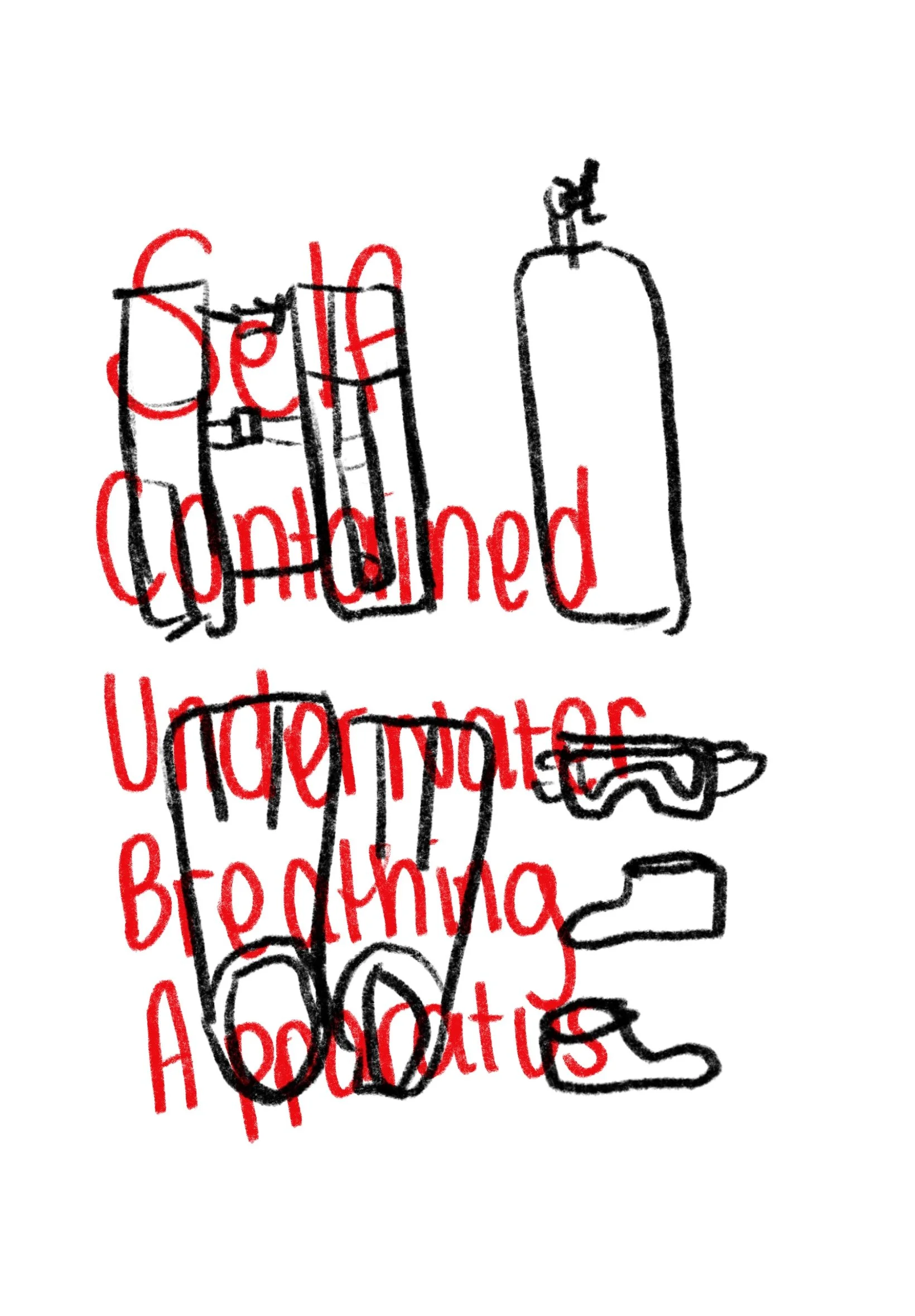
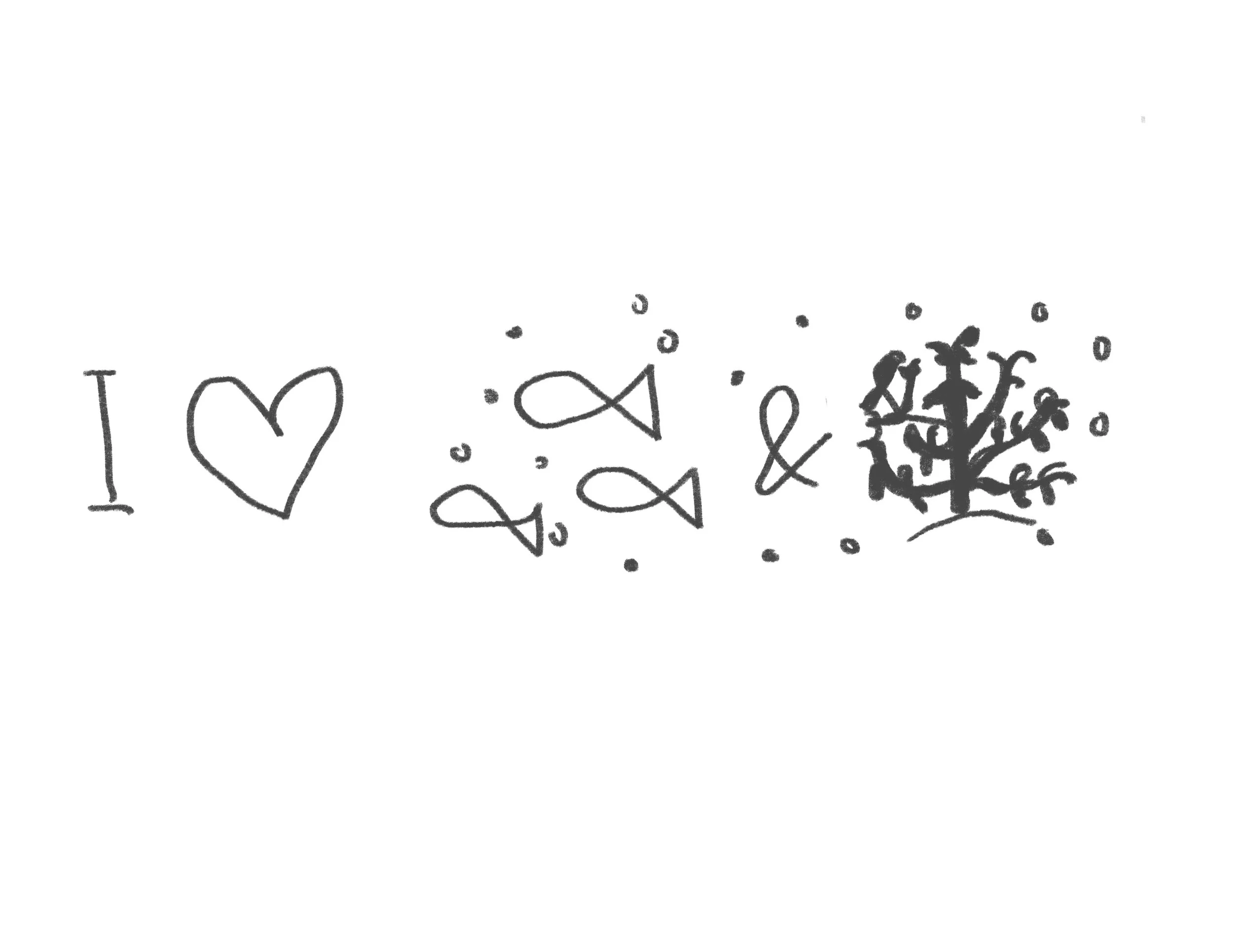
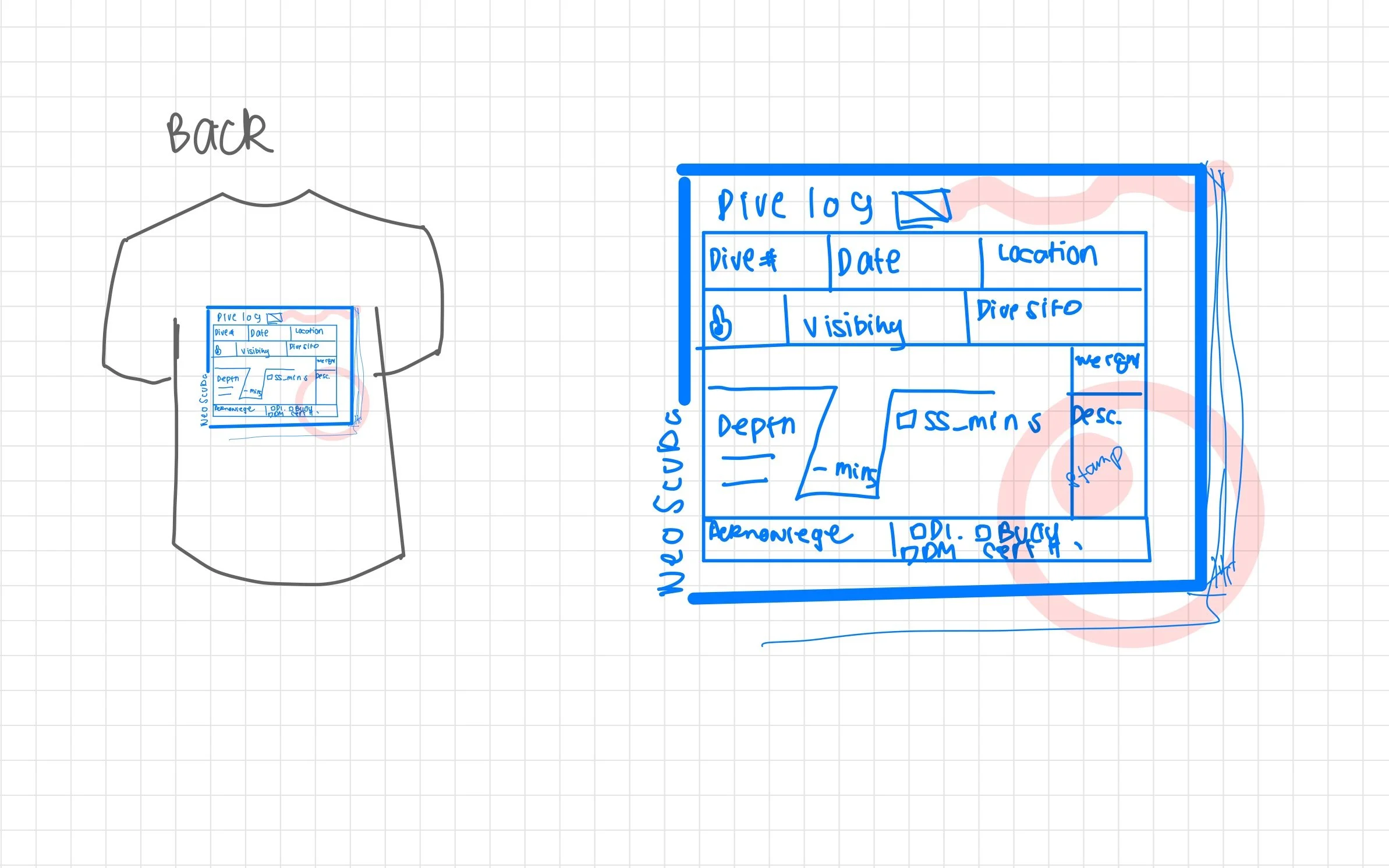
Selected initial sketches on shirt designs.